I came across a Facebook ad for a dated, two piece, cherry t.v. armoire. It was a higher end piece, but it was scratched and missing hardware, and more importantly, it was so very dated. It was screaming 1990s. I know very few people use these anymore, but I *really* liked the details on it and I thought it would be beautiful with a little creative painting to bring out those details. After several days of absolutely no one commenting on the post, I finally bit the bullet and bought the armoire. I wasn't sure if people didn't see the potential, if they thought it would be too much work, or if I was having delusions of grandeur, but I had committed to it and I was going to see it through! This is a screen shot of the picture from the FB ad. You're seeing exactly what I saw before I purchased it. Lovely, isn't it? If you look past the dated finish, you'll see lots and lots of beautiful details hidden in there. You can see feathers on the sides and some rope detail. And how about the overall shape? It really was pretty. Have I convinced you yet?
 I had a grand vision of painting her aqua. Last winter aqua and turquoise were very hot colors here and I thought it would sell quickly. I sanded it down, filled in some of the drawer pull holes, and then I brought out some BLACK paint and went to work. What?!?! I never, ever use black paint so I have no idea why I got it out that night, but I'm so glad I did. Btw, I used latex paint and made my own homemade chalk paint.
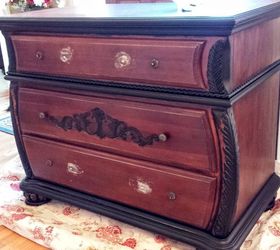 When doing very detailed work like this, I will paint the areas I *think* should be highlighted, but sometimes I will go back and change part of the highlighted area to the base color if I don't like how it's looking. Keep an open mind when you're doing detail work. Take a break, step back, and evaluate as you go along.
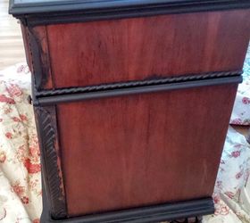 When using two toned color schemes, I always make sure the colors will complement each other instead of them fighting with each other for attention. Have you ever seen a piece of furniture where you like both colors individually, but for some reason they don't seem to go together on that piece of furniture? Choose your colors wisely. Then wisely choose which one should be used as the "highlighting" color. Believe me, this does make a difference. My two colors would not have worked if I had reversed them. Black base color with this very light gray trim? Nope, wouldn't have worked.
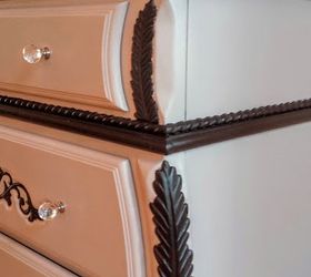 I filled in drawer pull holes so that I could use knobs only. I chose large crystal knobs for a touch of class and sophistication, but also to keep the front of the Bombay chest less busy so that the eye would be drawn to the black details.
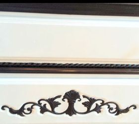 I love the bold, black details against the subtle gray.
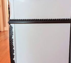 And here she is! The bottom of the dated T.V. armoire became a stunning, sophisticated Bombay chest. Btw, the top portion was converted into a little girl's dress up closet. How sweet is that? For more pictures, specific colors, and links to the crystal knobs you can read my post at: http://www.thetatteredrabbit.com/upcycling-a-t-v-cabinet/
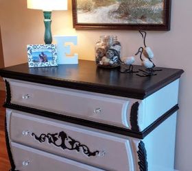
Original article and pictures take http://www.hometalk.com/14312438/how-i-upcycled-a-t-v-cabinet site
Комментариев нет:
Отправить комментарий